Get 50% off using code MOCKUP at checkout

Top 10 Mistakes Your Brand Is Making & How to Fix Them
As a brand owner, you know that your product images are often the first interaction potential customers have with your clothing line. The quality and accuracy of these images can make or break a sale. Unfortunately, many brands make common mistakes when creating mockups for their products. In this post, I’ll walk you through the top ten mistakes your brand might be making with its product images and how to avoid them.
1. Using Low-Quality Mockups
High-resolution, photographed mockups are a must for your product images. Relying on low-quality, tech-based mockups or vector images can make your products look unprofessional and unappealing. Real, photographed mockups provide a realistic representation of your products, making them more attractive to potential customers.
Tip: Choose mockups that reflect the texture, color, and fit of your clothing accurately. Tools like Mock It’s mockup generator offer a wide variety of high-quality, photographed mockups that are perfect for showcasing your products.
2. Only Using One Type of Mockup

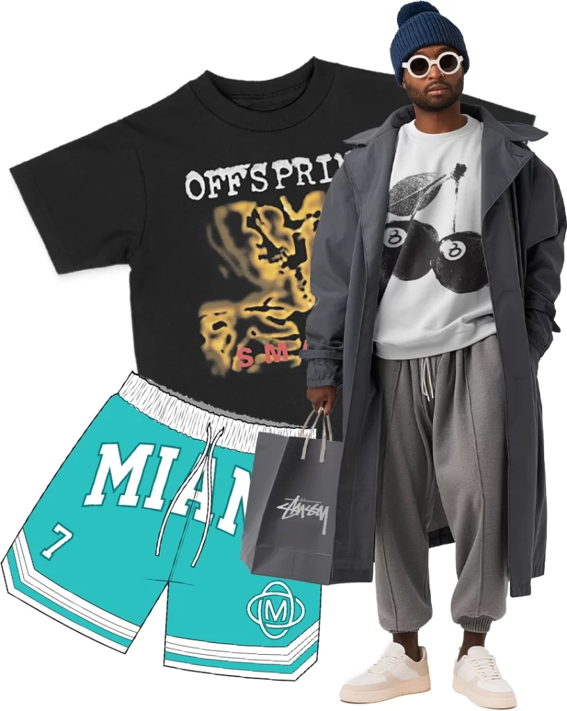
Diversifying your mockup types is crucial. Sticking to just one type of mockup, like flat lays, limits how customers perceive your brand. Flat lays are great for showcasing designs, but incorporating model mockups adds context by showing how the clothing fits and moves on a body. Lifestyle shots, which show your clothing in real-world settings, can also enhance the narrative of your brand.
Tip: Combine flat lays, model mockups, and lifestyle shots to provide a well-rounded view of your products. Check out these versatile mockup options to elevate your product imagery.
3. No Narrative in Your Product Images
A strong narrative is essential for creating an emotional connection with your customers. A great design on a t-shirt doesn’t mean much without a compelling story behind it. Your product images should tell a story—whether it’s about the quality of the material, the uniqueness of the design, or the lifestyle your brand represents.
Tip: Think about the story you want your brand to tell. Use your mockups to illustrate this narrative. For more on creating compelling narratives, download our comprehensive guide.
4. Using Generic or Overused Mockups
Generic mockups, especially those found through a quick Google search, can detract from the uniqueness of your brand. If you’re printing on a specific brand like Shaka Wear, make sure to use a mockup that accurately reflects that item. Using the right mockup enhances your brand’s authenticity and helps build trust with your customers.
Tip: Use branded mockups that align with the specific products you’re selling. This ensures that what customers see online is what they receive, maintaining brand consistency and credibility.
5. Ignoring Diversity in Your Product Images

Your customers want to see themselves reflected in your product images. Using a diverse range of models in terms of race, size, and gender can help you connect with a broader audience and create a more inclusive brand image.
Tip: Make sure your product images are diverse and representative of your customer base. Explore diverse model mockup options to create more inclusive product imagery.
6. Using Unbranded Mockups
Whenever possible, use a mockup that matches the specific item you’re selling. Accuracy is key. If your mockups don’t accurately represent your products, it can lead to customer dissatisfaction and damage your brand’s reputation.
Tip: Check out Mock It’s branded mockup collection for a range of accurate and high-quality options that match the specific items you’re printing on.
7. Using the Wrong Mockups in the Wrong Places
Different platforms require different types of images. While tech mockups might work for internal presentations or mockup approvals, they aren’t suitable for social media or websites. Similarly, too many flat lays on your social channels can make your brand look static and uninspired. Aim for a mix of lifestyle shots, flat lays, and model mockups for a dynamic presentation.
Tip: Optimize your mockups for each platform. For more tips on this, download our ebook on how to use mockups effectively across platforms.
8. Being Inconsistent
Consistency is key to creating a professional-looking brand. If you use a mix of different types of mockups, your product images may appear disjointed and confuse potential customers. Aim for a cohesive look by using similar styles, backgrounds, and lighting in all your mockups.
Tip: Create a brand guideline for your mockups to ensure consistency. For more tips, download our guide to maintaining a consistent brand image.
9. Cluttering Your Product Images

Less is more when it comes to product images. Overcrowded images with too many elements can distract from the product itself. Keep your images clean and focused on the clothing to ensure the product remains the star of the show.
Tip: Use simple backgrounds and minimal props to keep the focus on your product. Browse clean mockup templates that help you achieve a minimalist aesthetic.
10. Inaccurate Color and Fit
The color and fit shown in your product images should match what customers receive. Inaccurate representations can lead to returns, negative reviews, and a damaged reputation. Using branded mockups that offer accurate color and fit is crucial to maintaining customer trust.
Tip: Invest in high-quality mockups that offer true-to-life color and fit. Mock It’s extensive range of branded mockups can help you achieve this.
By avoiding these common mistakes and optimizing your product images, you can enhance your brand’s appeal and increase conversions. Want to learn more about creating the best product images for your brand? Check out my ebook, which covers everything you need to know about using and creating clothing mockups!
